The Evolution of the Menabrea Logo
Since 1846 Tradition and Modernity
have been Our Brand Values
XIX Century
1872
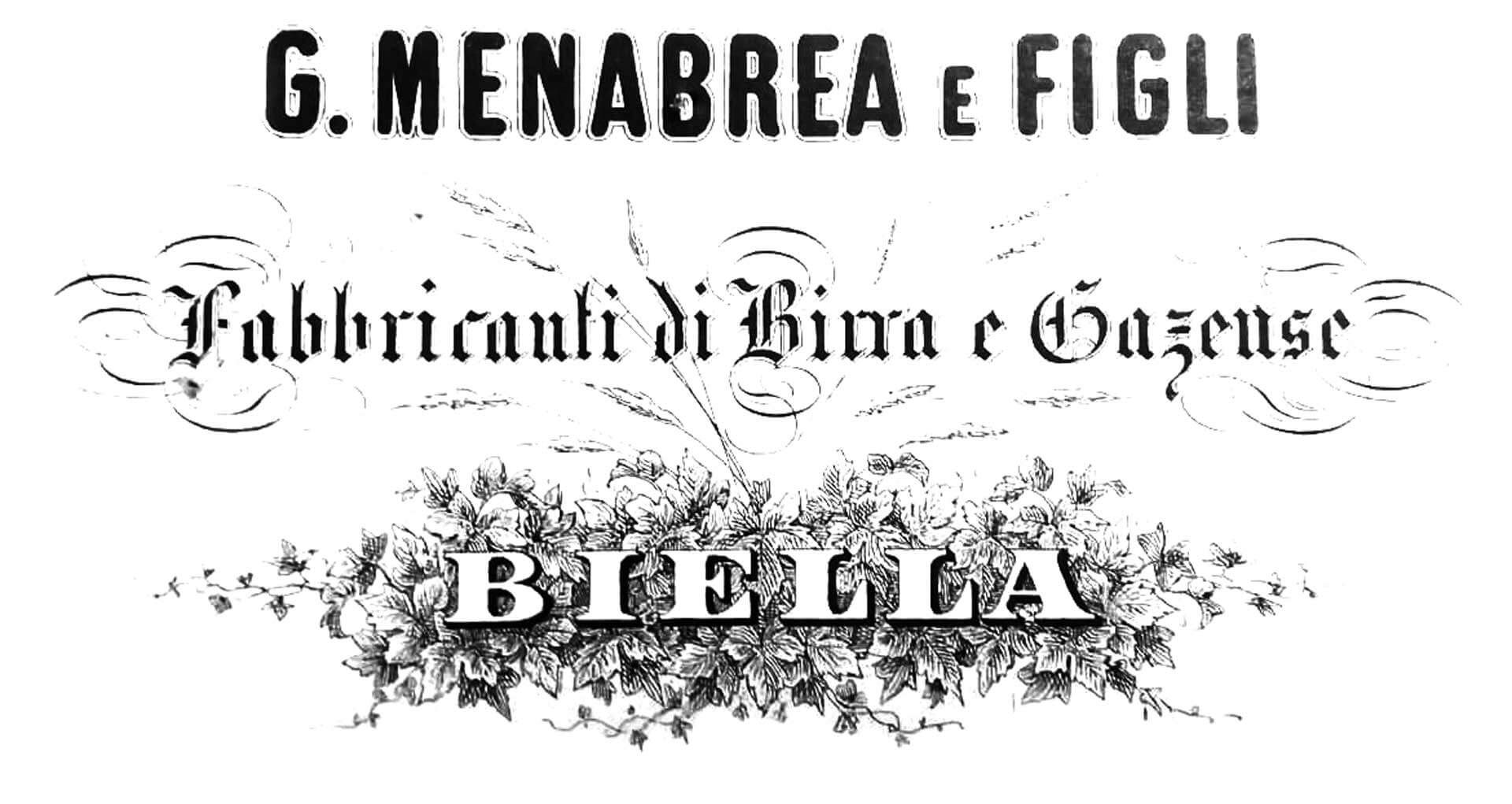
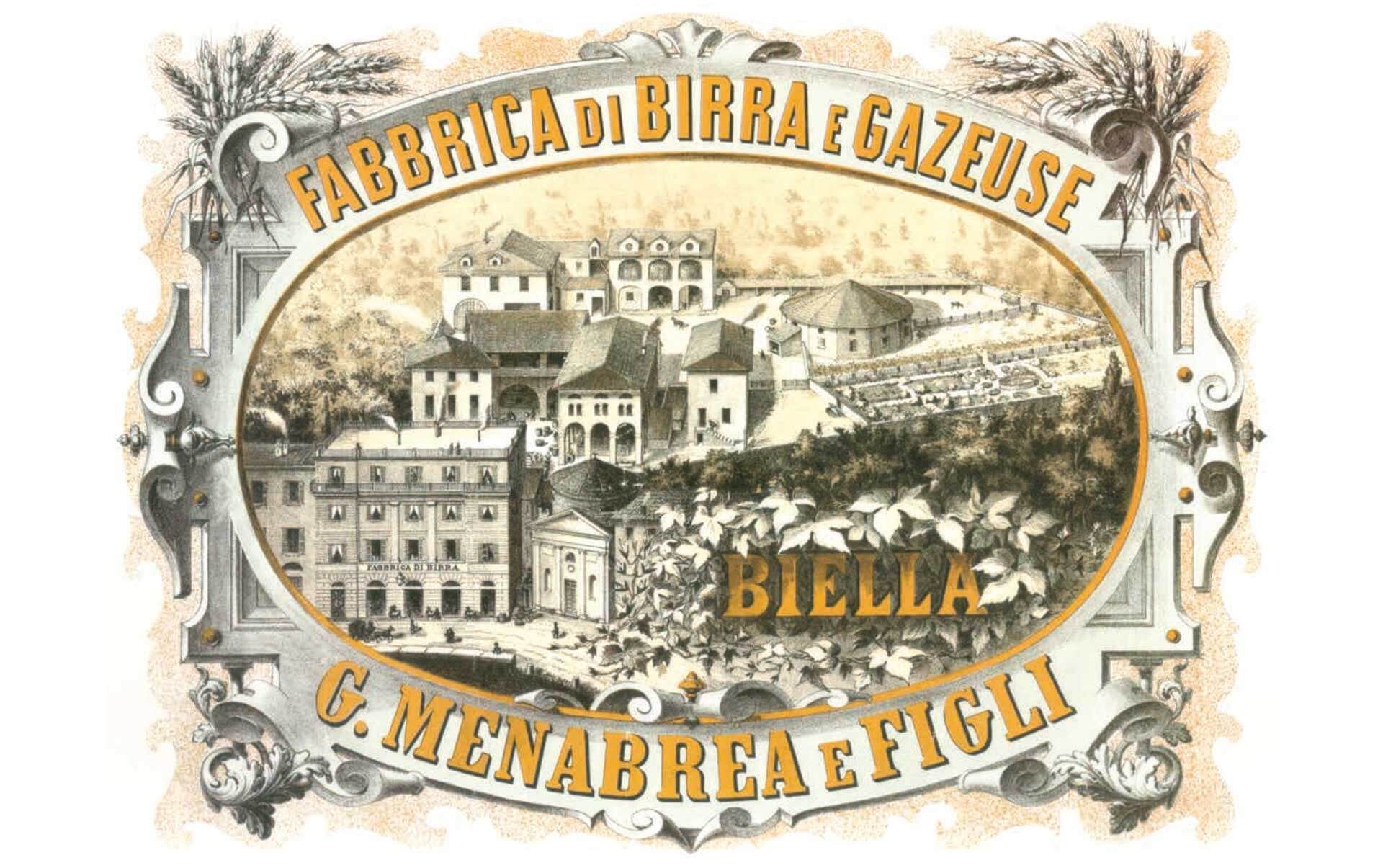
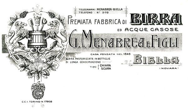
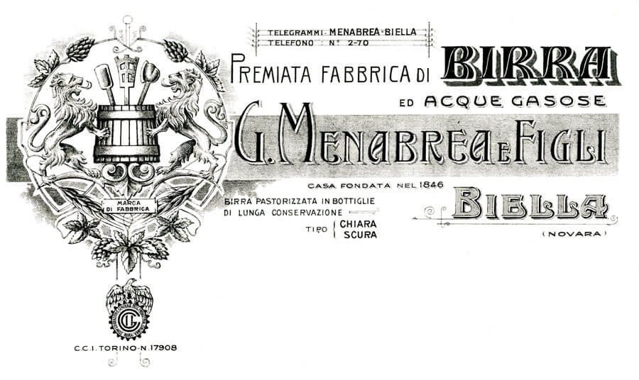
After Zimmermann left the company Giuseppe Menabrea introduced the nomenclature "G. Menabrea and Sons". This heading, accompanied by the specific "Makers of Beer and Soft Drinks" and the Biella location, will henceforth make its appearance on all official documents.
The inscription "G.Menabrea e Figli" cannot yet be considered a real logo, as the typeface undergoes continuous changes based on the aesthetic tastes of the time, thus demonstrating that the company is always in step with the times and is already attentive to the way of presenting itself to its consumers.
This wording, incorporated into the pictorial representation of the brewery, is embellished with ornamental motifs such as the fruits and the leaves of the hop and ears of barley, indicating the ingredients of Menabrea beer. These fundamental elements will always be used and they will characterize the definitive brand.
Over the years, the brewery will be laid out with extreme precision and manufacturing pride. New facilities will be added from time to time aimed at optimizing production efficiency.
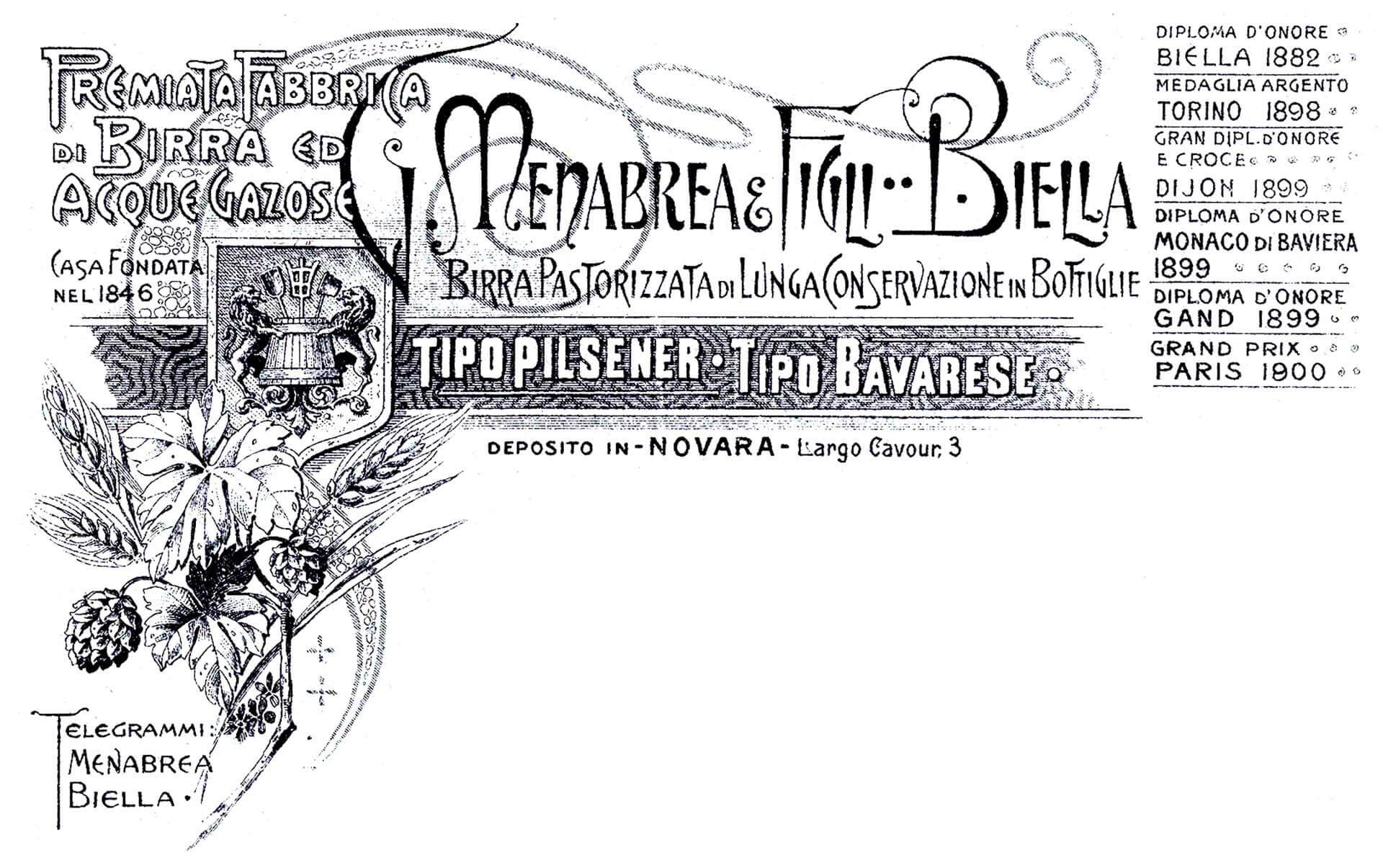
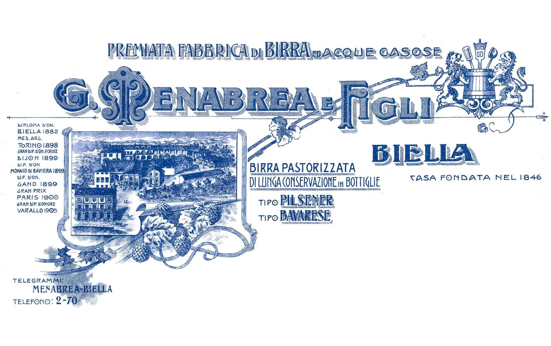
1900. The Logo Elements
and the first Registered Trademark
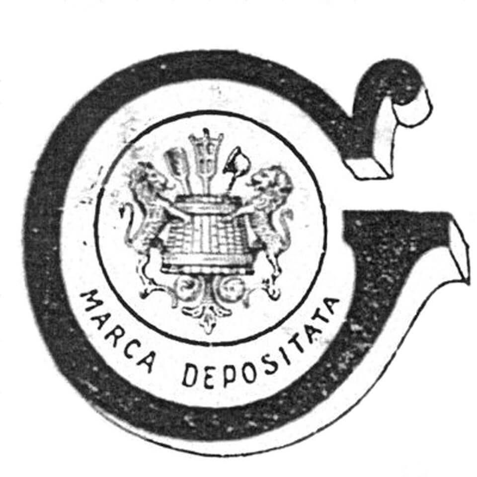
While the reason for identifying the company with the tools for brewing is obvious, it remains to be explained why they used heraldic symbols featuring wild animals.
The Menabrea Family did not have their own family crest, but they had been awarded aristocratic titles for their military and administrative service to the Kingdom of Italy.
Precisely because of these honours, it is conceivable that they considered it appropriate to choose emblems of nobility, such as rampant lions, to represent them.
But the main reason is another. The lion reaching out to its prey - also a metaphor of courage and strength - is the emblem of the Val d'Aosta Region of North-West Italy and also the Municipality of Gressoney, the ancestral home of the founding families of Menabrea.
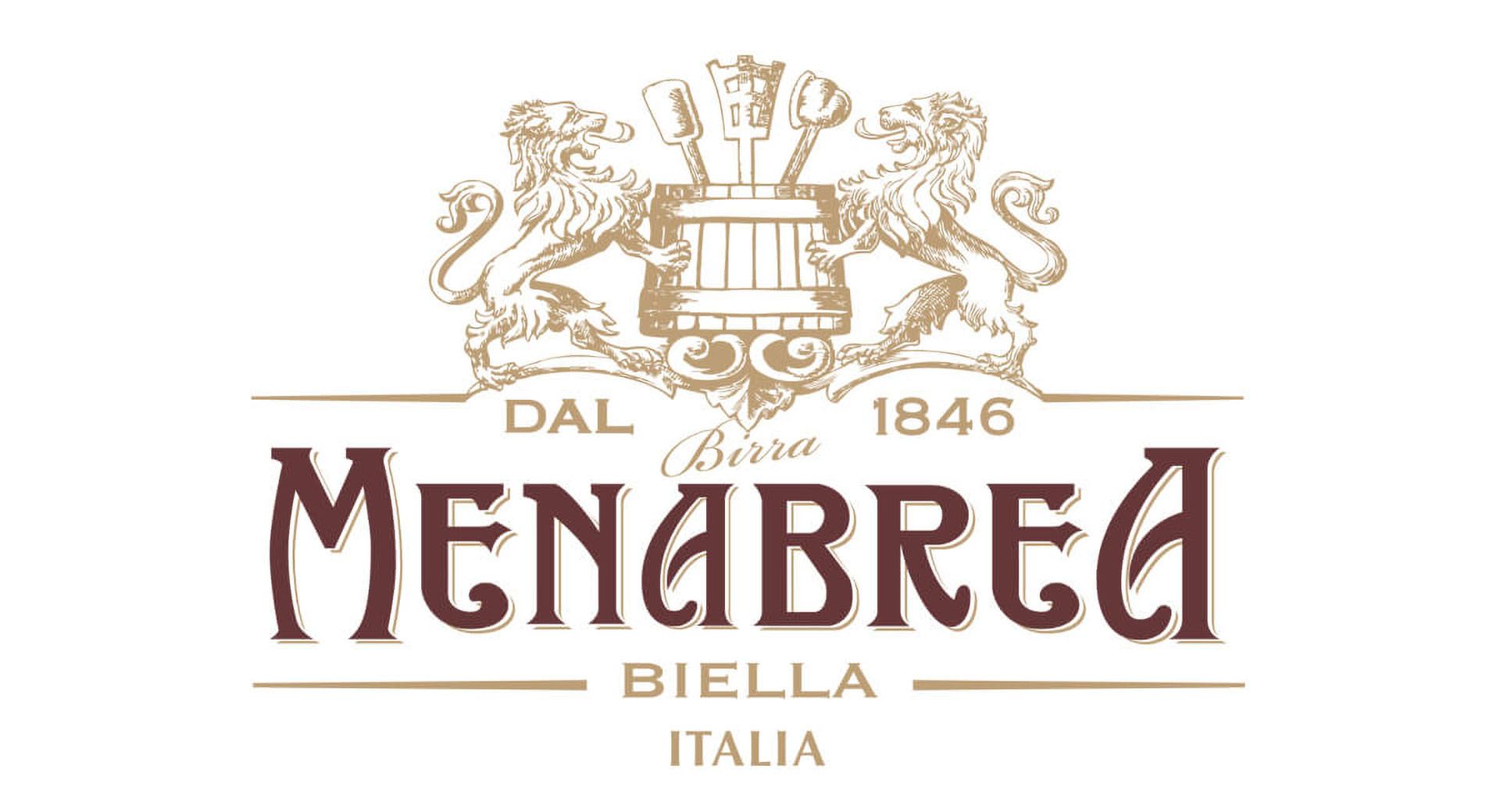
2015. The brand redesign
The Menabrea Brewery has a traditional "soul" inextricably tied to its location in Biella, to the original recipe and to the high quality of ingredients that this recipe demands. But, at the same time, the brewery is a constantly evolving reality aiming at continual improvements, from every point of view.
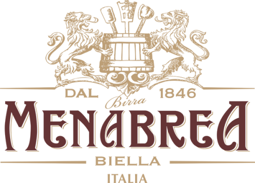
So, "G.Menabrea e Figli" is now Menabrea.
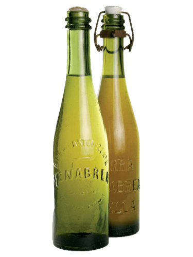
An innovation that is in reality a return to its origins and to the days when the first glass bottles simply bore the embossed family name "Menabrea". A family name that has since 1846 meant "beer of excellence".
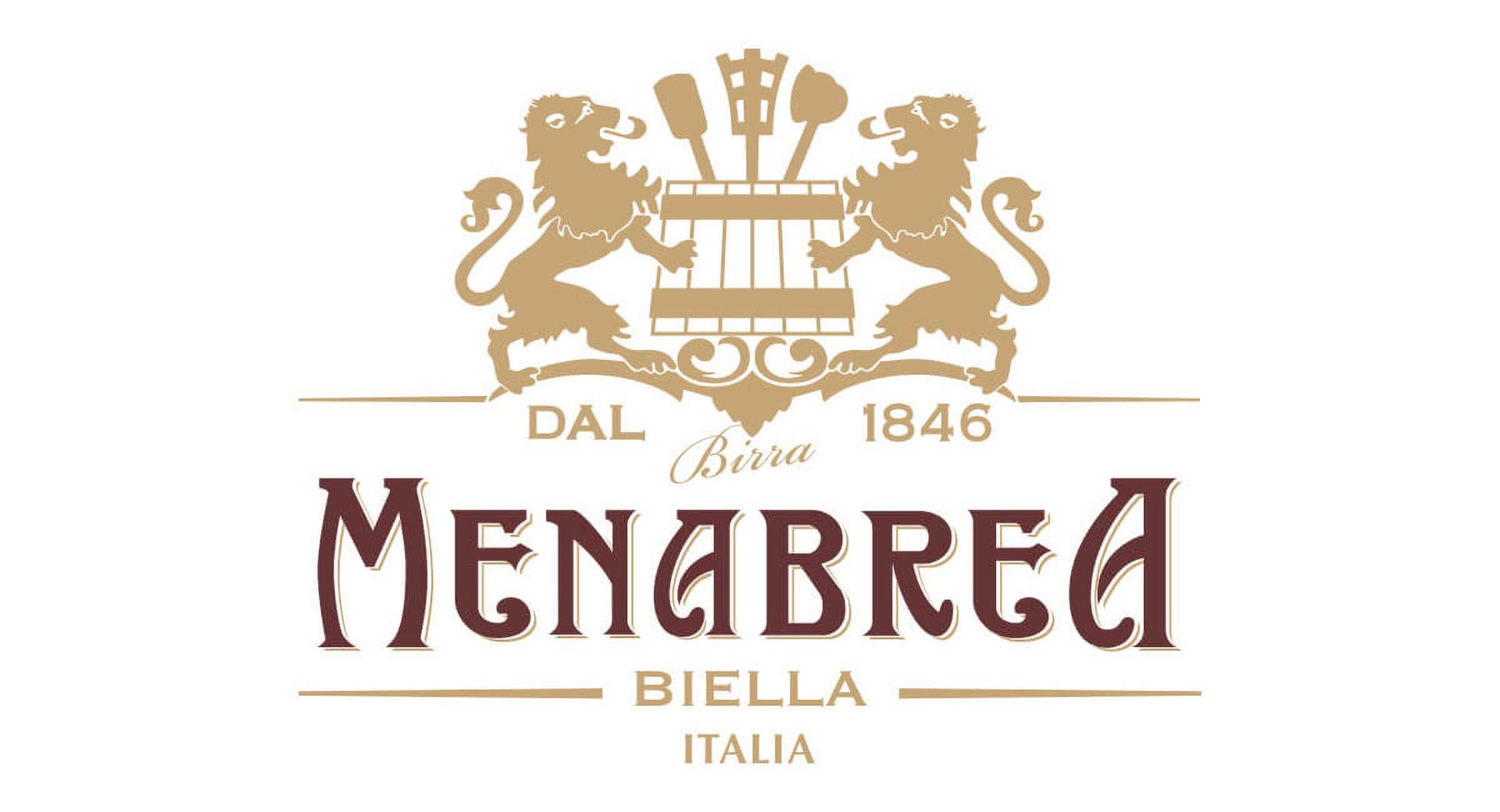
The letter style has been modified to improve, simplify and modernise, without losing the original graphic features.
Even the elements of the coat of arms have been transformed, synthesized and lightened whilst preserving, with respect and careful thought, those existing primary elements.
A re-branding consistent with a brand that can be contemporary, without giving up its past.
